newsletter design for rouvy.
I found this job listening on startupjobs.cz. It was for a designer for a cool innovative company called Rouvy.
Short description on Rouvy: Rouvy creates an at home biking experience, thanks to special equipment you can train at home / using real routes and accompanied by real riders (even trainers). You can track your progress, have a fun time with other cyclist friends (even if the weather isn’t all that tire friendly) and overall work on your fitness.
Cool concept, right? Exactly.
I mustered up an email, triple checked for typos, brewed a coffee and hit send.
Rouvy was thankfully very quick with their reply. Before anyone reading this says what the heck, after reading the next couple sentences – case studies in the Czech republic are absolutely normal – albeit a bit annoying, especially if applying to multiple jobs.
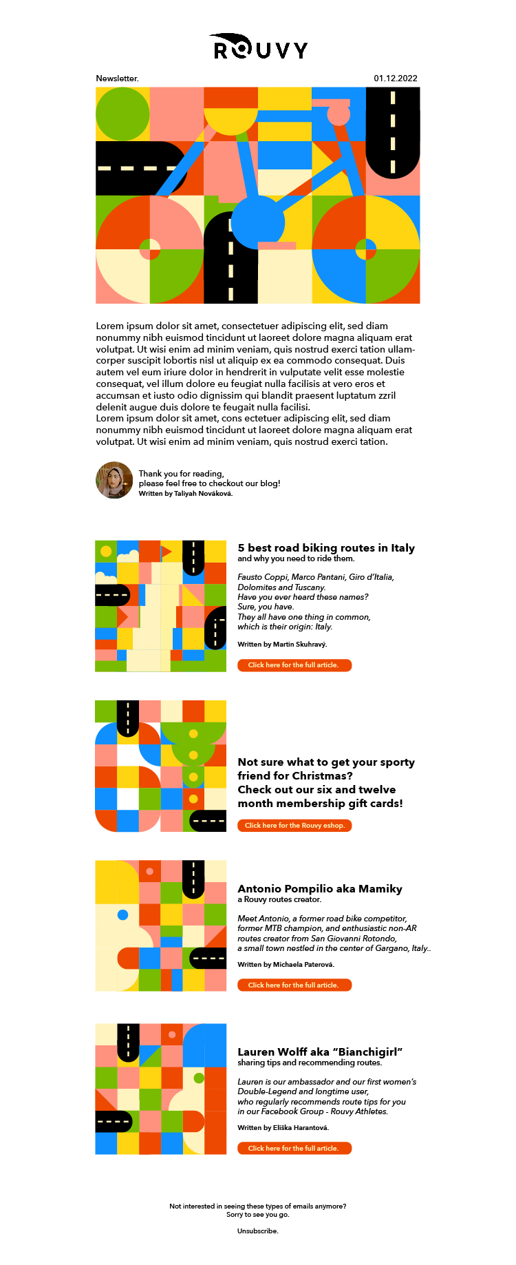
What was I supposed to create for Rouvy? I would place a screenshot here, but in all honesty, I’m not sure I can.
I was supposed to write down everything that was wrong with an advert they used on Facebook. Create a banner (seen below) for Instagram, Linkedin and Facebook. What was on the banner and what the use case of it was was totally up to me. With that I was tasked with writing down the major differences across different social media platforms. Next up was the task to create a newsletter for them. This newsletter had to include an image at the top and images for four articles/products/routes – ideally sourced from their blog.
I gathered all this info, all while being mildly stressed out, because more companies required case studies (all with the same deadline). I had to straighten out some things with Rouvy, which thankfully gave me a prolonged deadline, because I had to wait for their reply before I could start creating.
I was stuck with Rouvy, I really didn’t know what direction I wanted to take this in, I know that my style doesn’t at all match that of Rouvy. I sat at my monitor, Behance and dribbble both open and filling up my scratch disks. I decided to message some people and ask for ideas. Everyone recommended that I create compositions, but this was something I really didn’t want to do. I didn’t receive any assets and finding half decent photographs to use was proving to be difficult – and an absolute waste of time, since it was demotivating me fairly quickly.
Not only this, but Rouvy pretty much only uses compositions, which in turn gives their brand a very tech startup look. I wanted to create something that wasn’t the standard and would stand out amongst candidates.
I decided to create a sort of square collage, as it contrasts how circular bikes are. It also works great for things like headers. I started out by just playing around. Quickly I realized that this was indeed the route I wanted to take. I found an image of a bike and started drawing it out in Illustrator with simple shapes on a grid. Alas – the header image was born, but now other issues arose…how can I design simple images that match the aesthetic I created, while being quick and easy to make, in case this ever became an actual thing and was sent out on a weekly basis. I used my square idea, looked up some of their products and just went off of my imagination. I added some curves and soft edges to balance out the sharp squares and keep a friendly look.
Going in to this I thought a lot about something I read on reddit. Women don’t participate in sports as much as men, which is a worldwide issue. Originally I wanted to make a banner animation of a woman riding a bike in a cozy blanked, coffee in hand and a cat on her head – I quickly opted out, because I realized that though this is something I would like to see, it isn’t something Rouvy would like to see. I didn’t entirely leave this idea though. I kept true to a part of myself and decided to steer from Rouvy’s colors and opt for cheerful, muted colors. Cheerful to attract different genders – since Rouvy’s design feels very modern, bold and slightly cold. Muted to keep it professional and keep it from appearing childish.
I still wanted to keep the overall aesthetic modern though, which I think I achieved thanks to font choice, balancing out bold type with text type and rounded buttons.
I always mention that I love to experiment with design in my emails to companies. In fact, I always tell my clients this as well. It’s fun to play with colors and shapes, even as an adult. Getting lost in composition, typefaces and the color wheel make me feel like a child again.
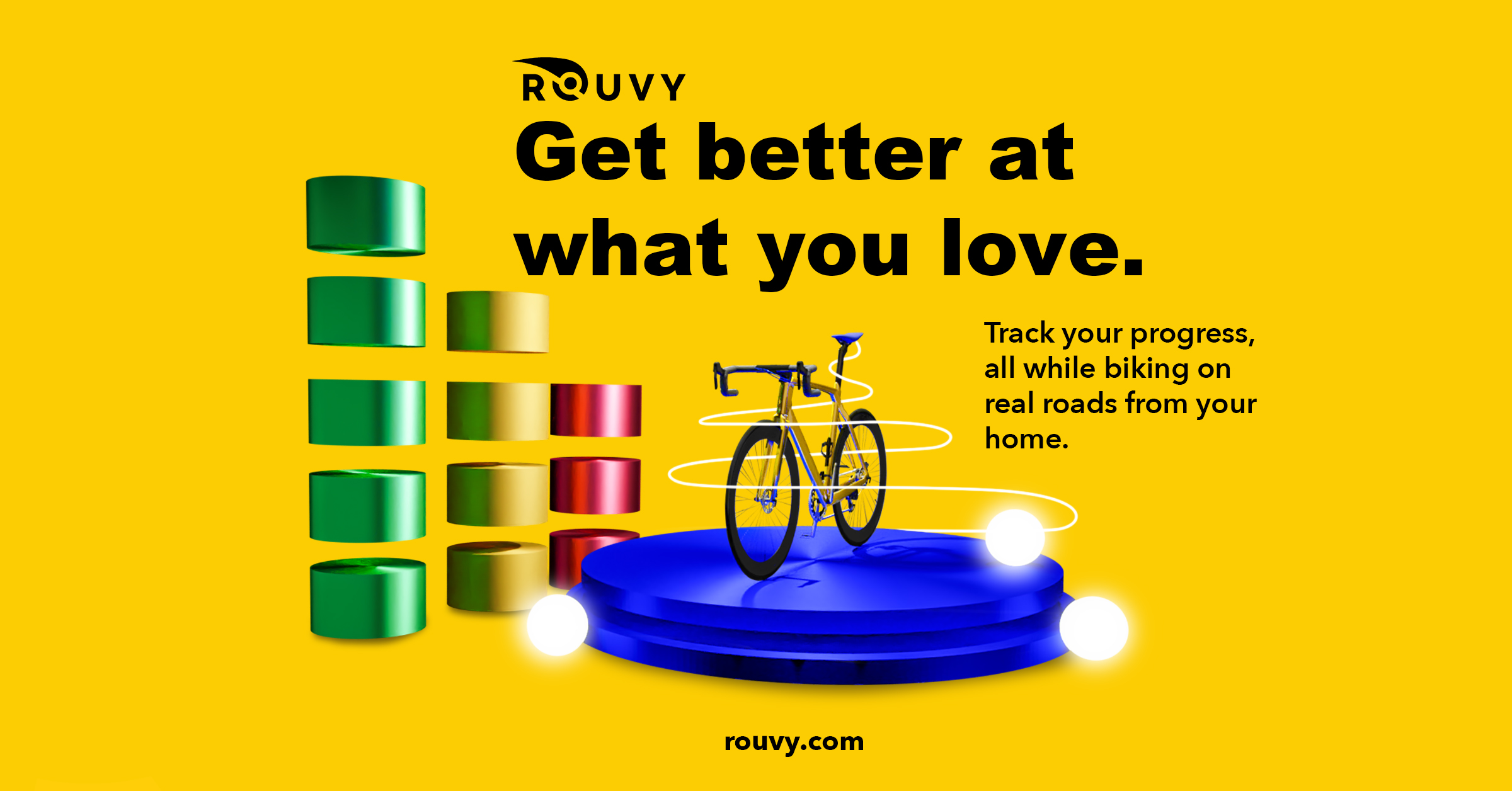
linkedin post banner for rouvy.
This Rouvy banner was created as part of the case study I got. For the background I used Rouvy’s signature yellow color.
I wanted to showcase the progress that reflects in the tagline on the right, which is why I added pillars of different heights to the left. Breaking them apart was a composition based decision. I needed to invite negative space to the banner, or else it would feel overly unbalanced. The colors of the pillars reflect progress.
I wanted to place the bicycle on something, so I opted to create an abstract podium, since the bike doesn’t move in your home, but stays in place.
Originally the text on this banner was bright blue – think my website. I opted out of this, since black and yellow are colors used for Rouvy’s designs.
The font chosen was meant to compliment the logo, but not take away from it. It is still rounded, but much shorter, while still keeping the modern techy vibes that come off of Rouvy’s overall look.