banner design for košík.
banner design for košík.
I don’t remember where exactly I found this job, but I remember that it was a long shot – right away. Košík is a fairly big grocery delivering service, our design styles couldn’t be further away.
So why’d I give it a shot? I approach all of these job listings as: well, even if I don’t get the job, I got a new contact and got to practice designing something.
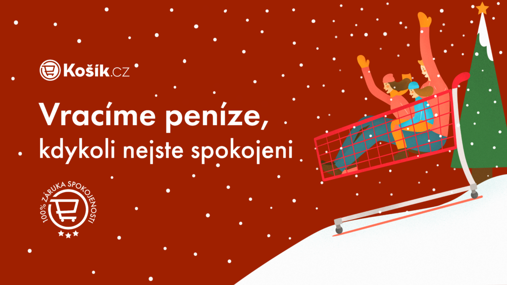
Within a week or two I got a reply from HR with my case study. I was to create banners for their website and resize them to fit on social media as well. The style wasn’t supposed to match their’s, in fact, they wanted me to be as original as possible. This case study was made before Christmas, so I decided to embrace the Christmas theme in the first image you can see here.
Košík means shopping cart in Czech, their brand colors are red. I took out my sketchpad, opened up my pencil case and started sketching. My first though was to draw a happy picture of a family sledding, but then I came up with the thought of people sledding in a cart. Not very realistic, but that’s totally fine when it comes to banners in this style. After finishing my sketch, I dived in to Procreate and drew the picture. The deadline for this case study was short. Christmas was coming and heck, I need a job. After drawing, erasing and redrawing, I got the result you can see here. I continued my work in Illustrator and Photoshop. Alas, the final banner was born and then resized to fit the rest of the requirements. I was happy with how this design looked, though looking at it now, I would most likely make some minor composition changes.
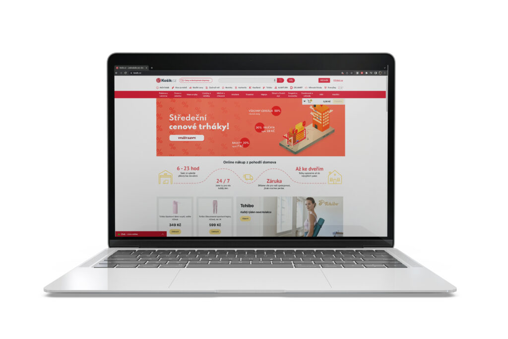
I opted to create another design, the one that you can see below.
A lot of ordering is done through a smartphone, so I decided that I wanted to showcase how your groceries are only a click away. I wanted to try a slightly different style, but still keep it true to myself. After all, doing case studies is controversial – it eats up a lot of time, if you have more, it can leave you feeling exhausted and with burnout, especially if you’re juggling side gigs or god forbid, a full time job.
I like to consider case studies a sort of practice exercise – give it my best shot while experimenting, playing around and getting better at different skills.
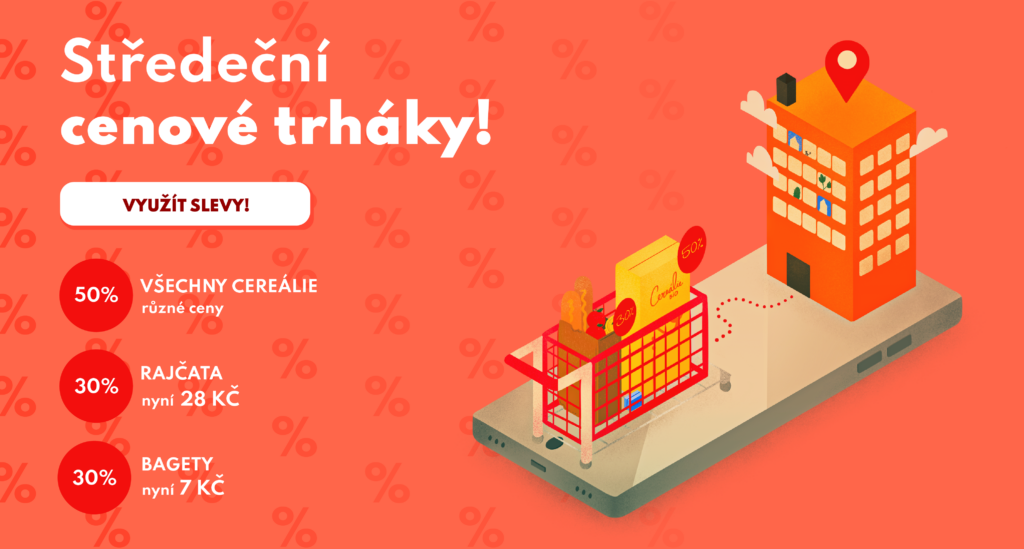
Anyways, enough about that. I had to create this banner for the theme Wednesday Sales. On it is the smartphone, a red cart and a location marker on top of the roof of a standard Czech panelak.
In all honesty, I am not a huge fan of this work. I think the illustration is nice, but I should’ve used images for the products, a different weight for the text in the button and maybe even different type sizes.
That is all for Košík, I didn’t get the job in the end, I’m not sure whether or not I ever got feedback or even a reply. I think I might’ve received: We decided to go with someone else, thank you. Which is absolutely valid.
The case study for this was fun though, I always like it when companies say not to do things in their style and play around with it. It feels like your work is less likely to get stolen, but also like you can practice more – which is always good.