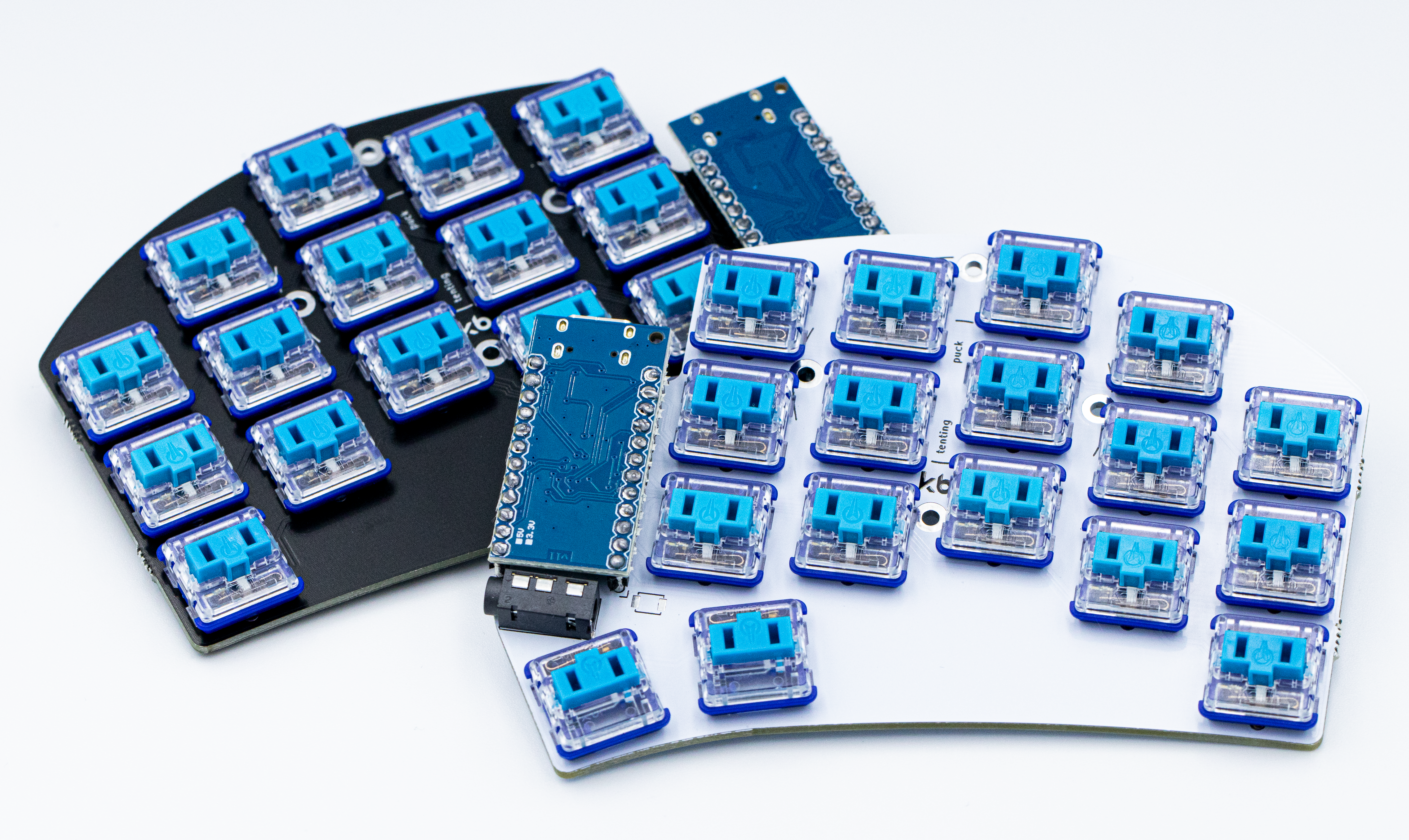
Qweebs is a company that sells premade split keyboards with the promise of ergonomics. The online shop isn’t limited to just that though, it also sells all kinds of different parts – switches, keycaps, diodes…
The client wanted me to create a logo that included their favorite colors: pink and purple. Through some trial and error we reached the logo you can see today. The square, reminiscent of the letter q’s tail is a simplified low profile keycap – another item the seller specializes in. The logo has black and white versions that are actively used, both just as memorable as the colorful one.
Now, let’s look at a quick logo presentation:
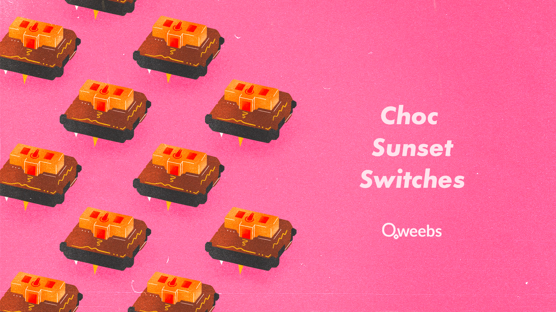
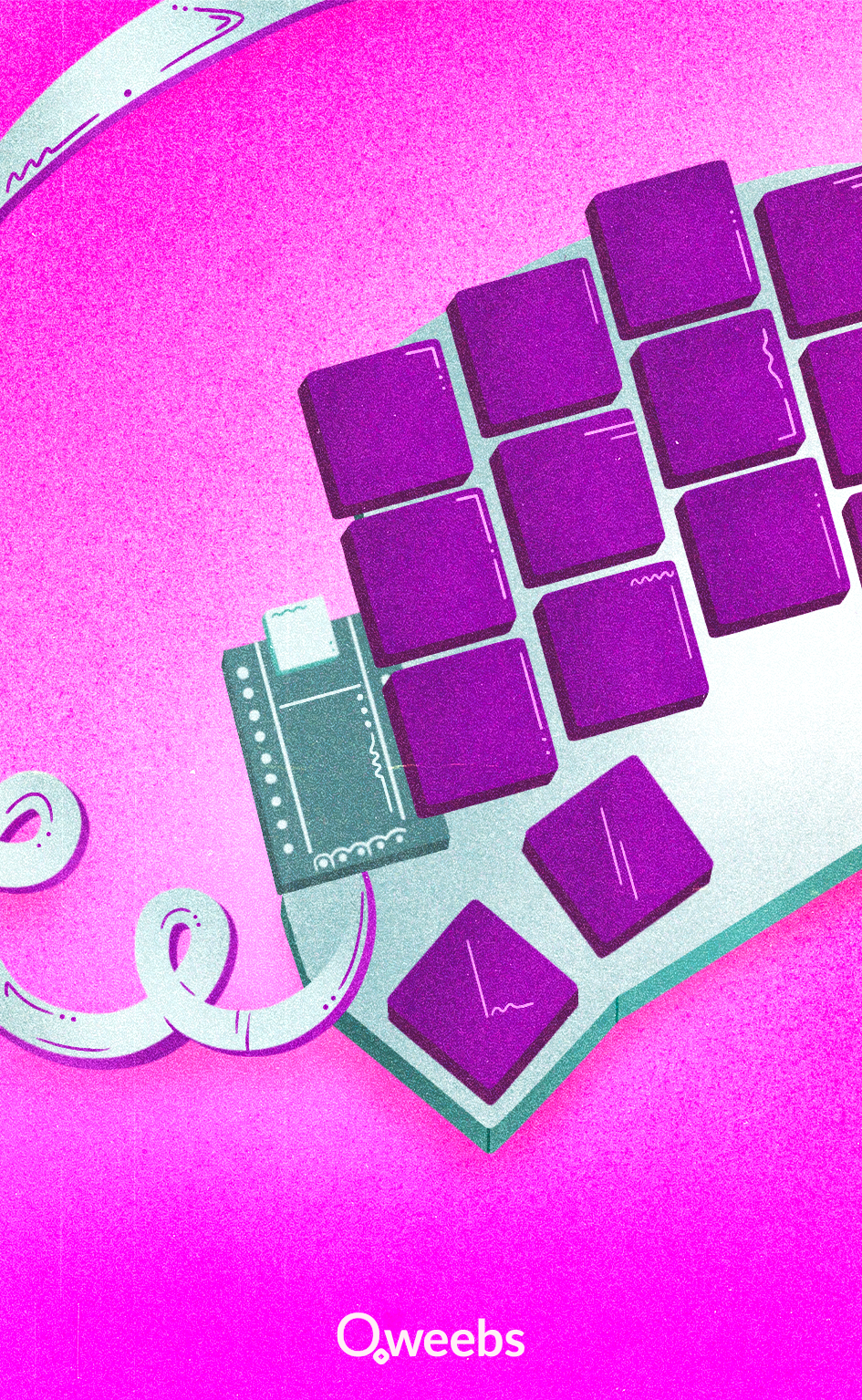
Both of us decided that we could create more awesome things together, I started taking photos for Qweebs and drawing illustrations for thank you notes and newsletters, you can view some of those here: